Eureka Camping


About Eureka! Camping
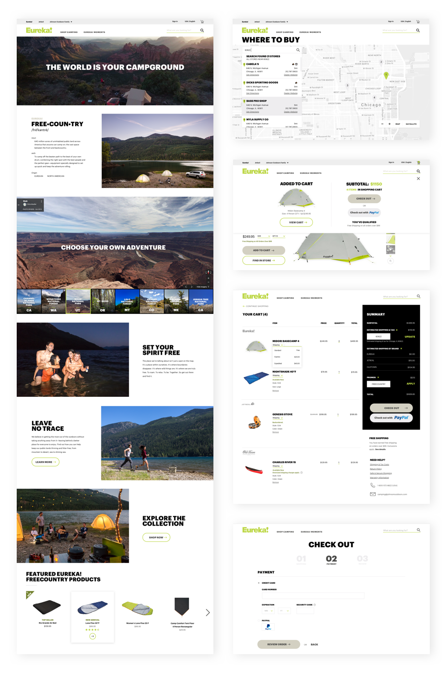
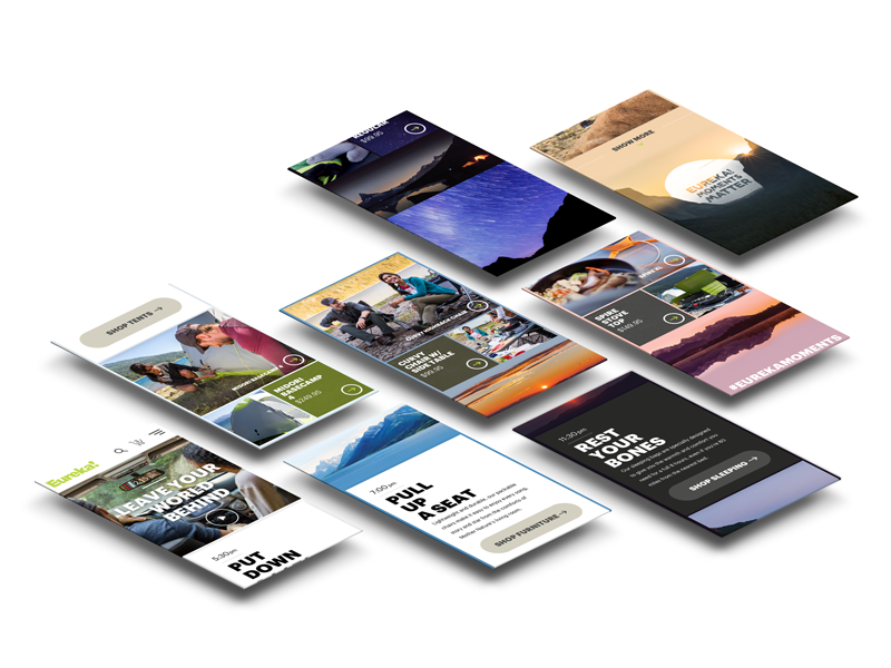
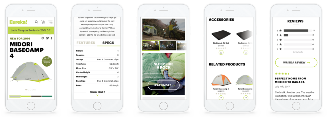
I led visual design on the Eureka! Camping experience. I took a set of brand guidelines and tailored them to a digital space. To introduce the brand and ecommerce experience we crafted a visual story around 'A Day in the Life of a Freecountry Camper.'
The Freecountry is almost limitless. It’s 640 million acres of public land all across America waiting to be camped and explored. The Freecountry is just a little off the beaten track, but feels a million miles away. Bring the cooler, a guitar and your swimsuits. From slacklining to stargazing, we’re free to find small moments of connection in big open spaces. Eureka! has perfected a mix of ingenious, intuitive equipment for Freecountry camping—stuff that sets set up quick and gets the adventures rolling from mountain to desert and sea to shining sea.


Work Process + Flow
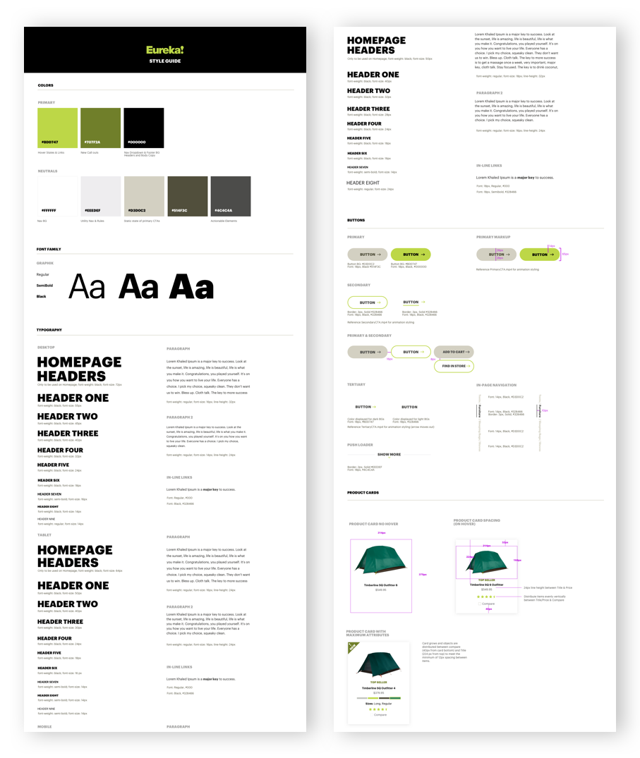
Eureka! is the first of seven sites for Johnson Outdoors that I'm leading design on. So I had to create a design system based upon components. When I sat down to create modules for the next seven sites, I first took a deep breath. After that I started to get a feel for the brand, creating style tiles. Next step was to create a digital style guide to give myself contraints to work within as well something to get development kicked off. A lot of sweat was poured over designing a 12-column grid for mobile, tablet and desktop. With vertical rows set to 8px, my entire design system is based off of this interval. If you don't use vertical rows we're done talking here. I provided art direction for the brand, based upon the story for the homepage of the site. The majority of the concepting for pages was down around whiteboards and (black) sharpie + paper.
Tools Used:
- Sketch
- Sharpie + Paper
- Illustrator
- After Effects
- Principle
- Lightroom
- Photoshop
- Media Encoder
- Miro
- Keynote
