T H E M I S S I O N
Overview
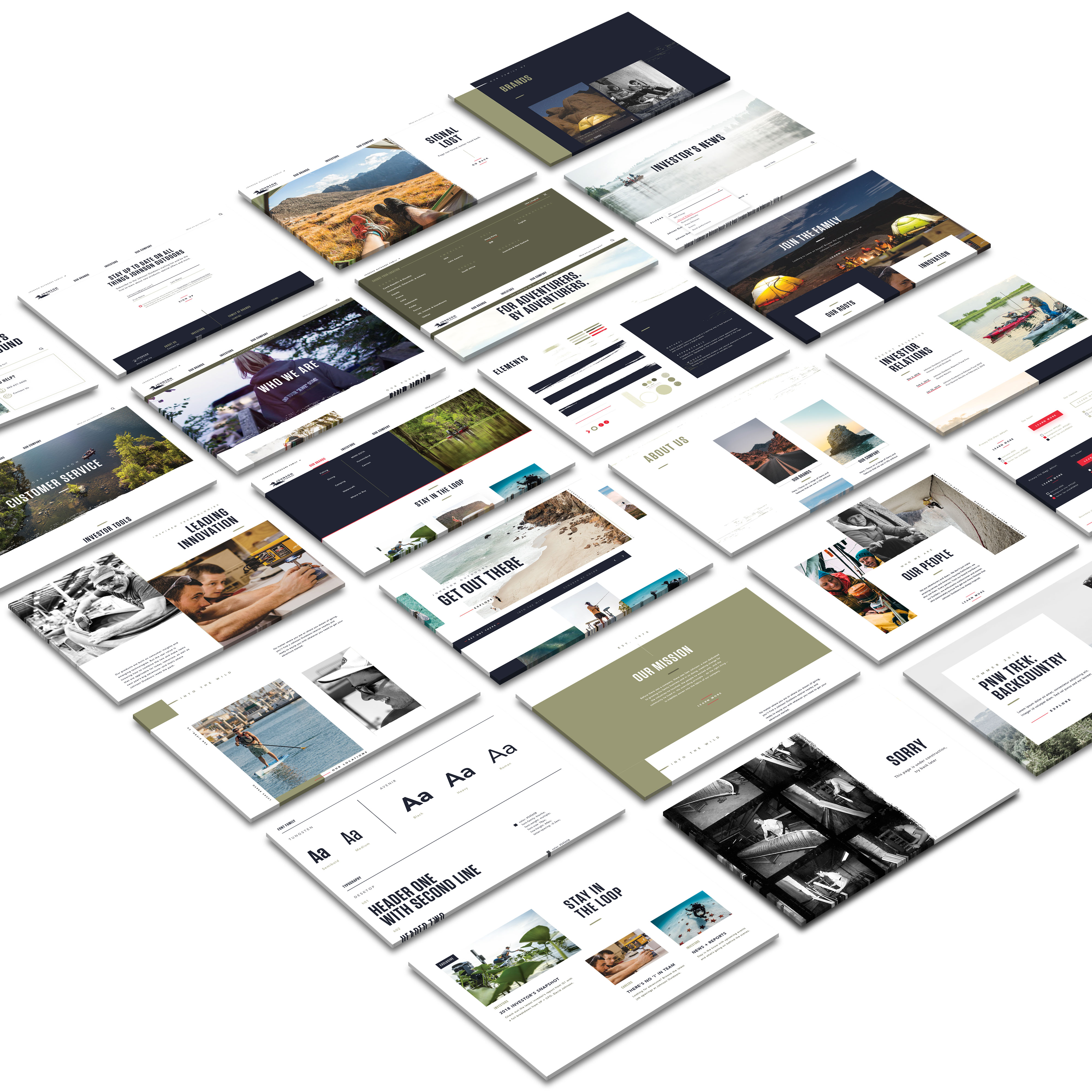
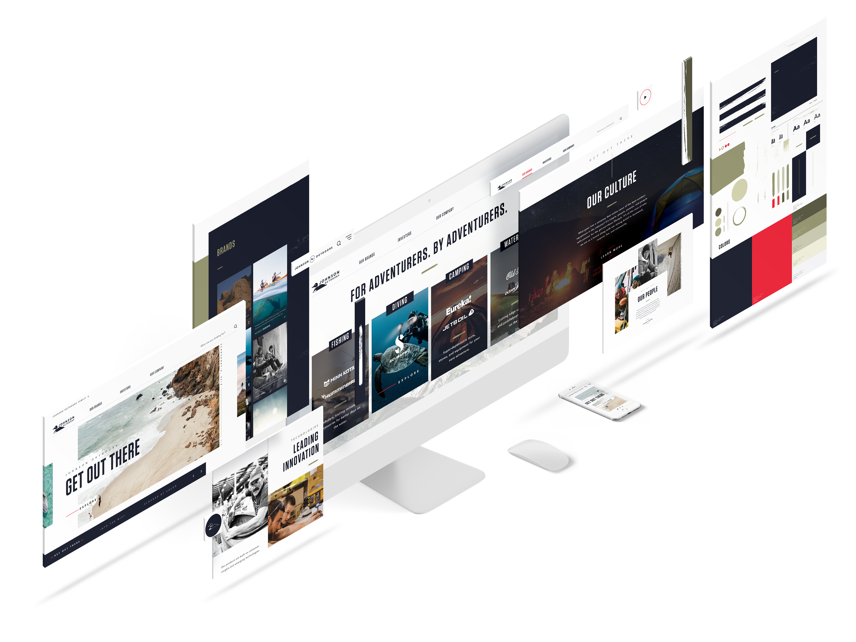
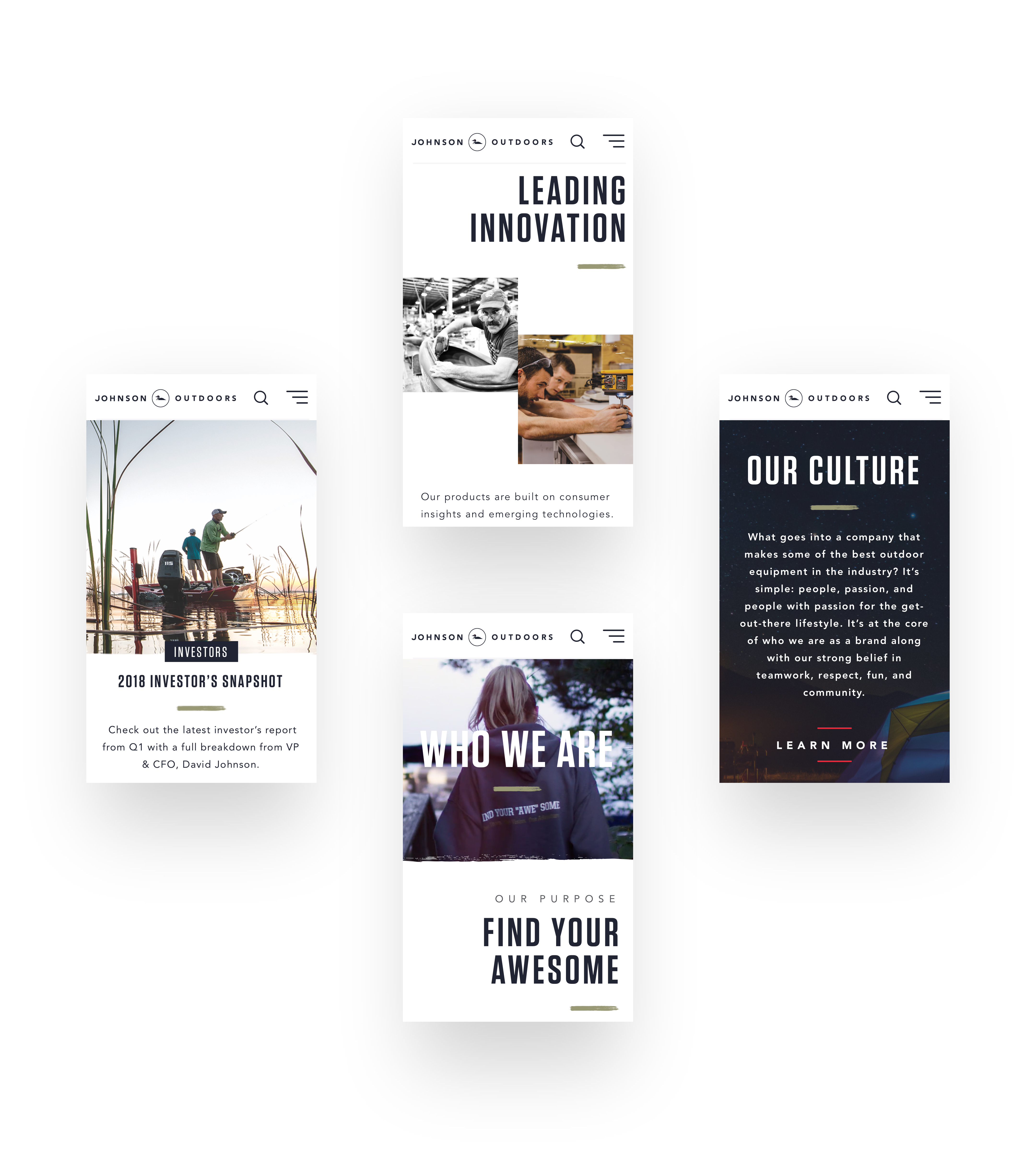
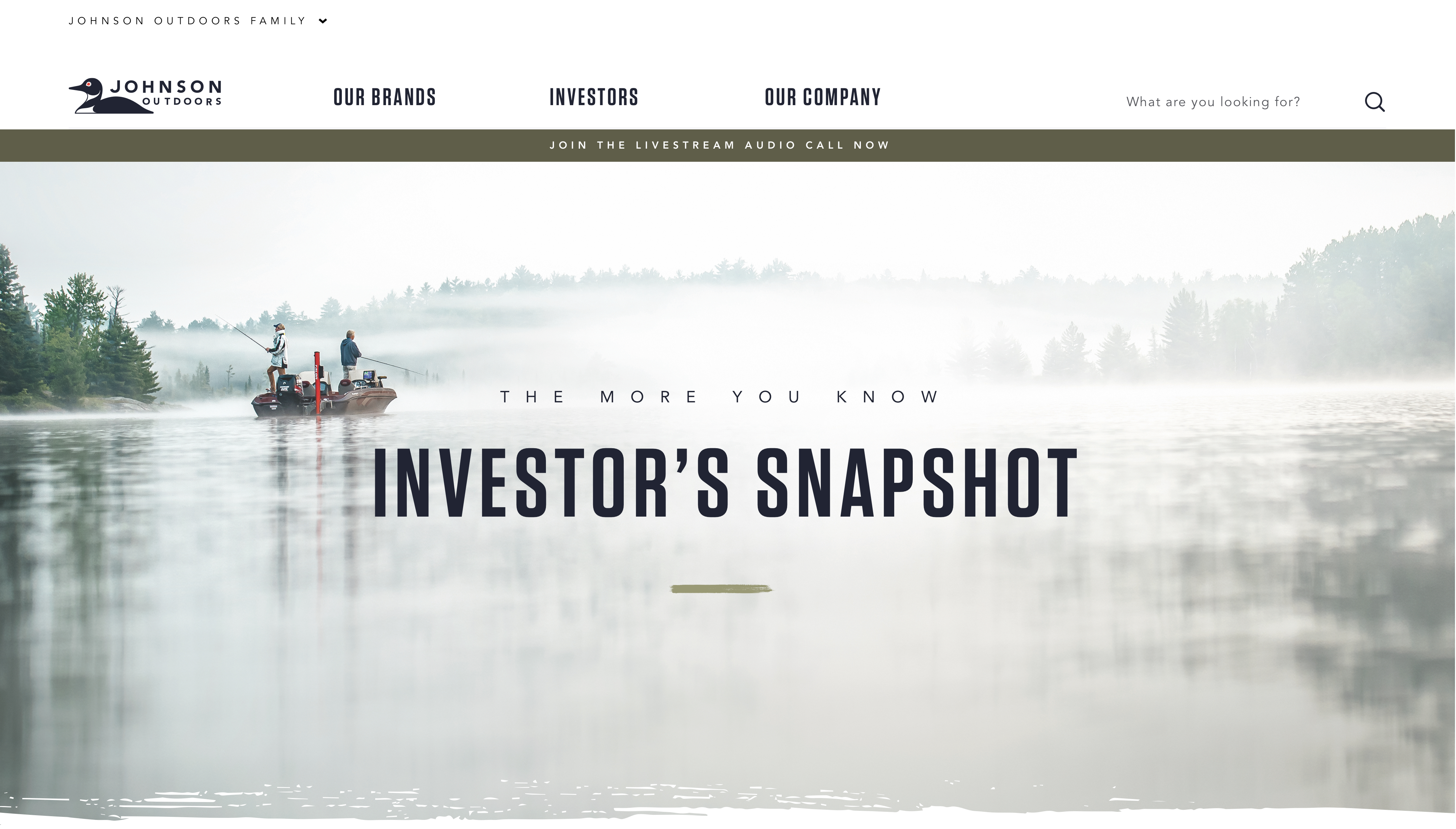
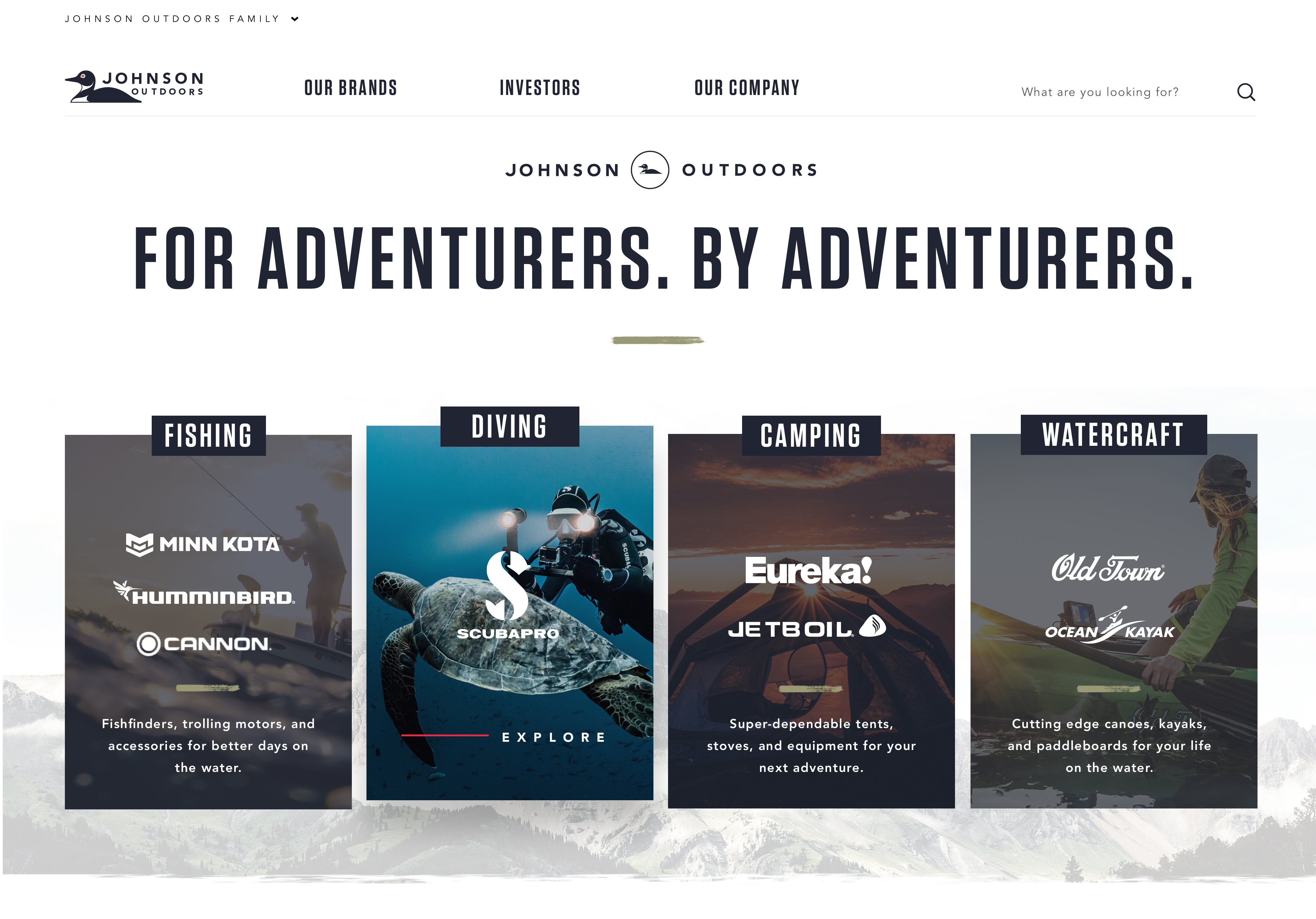
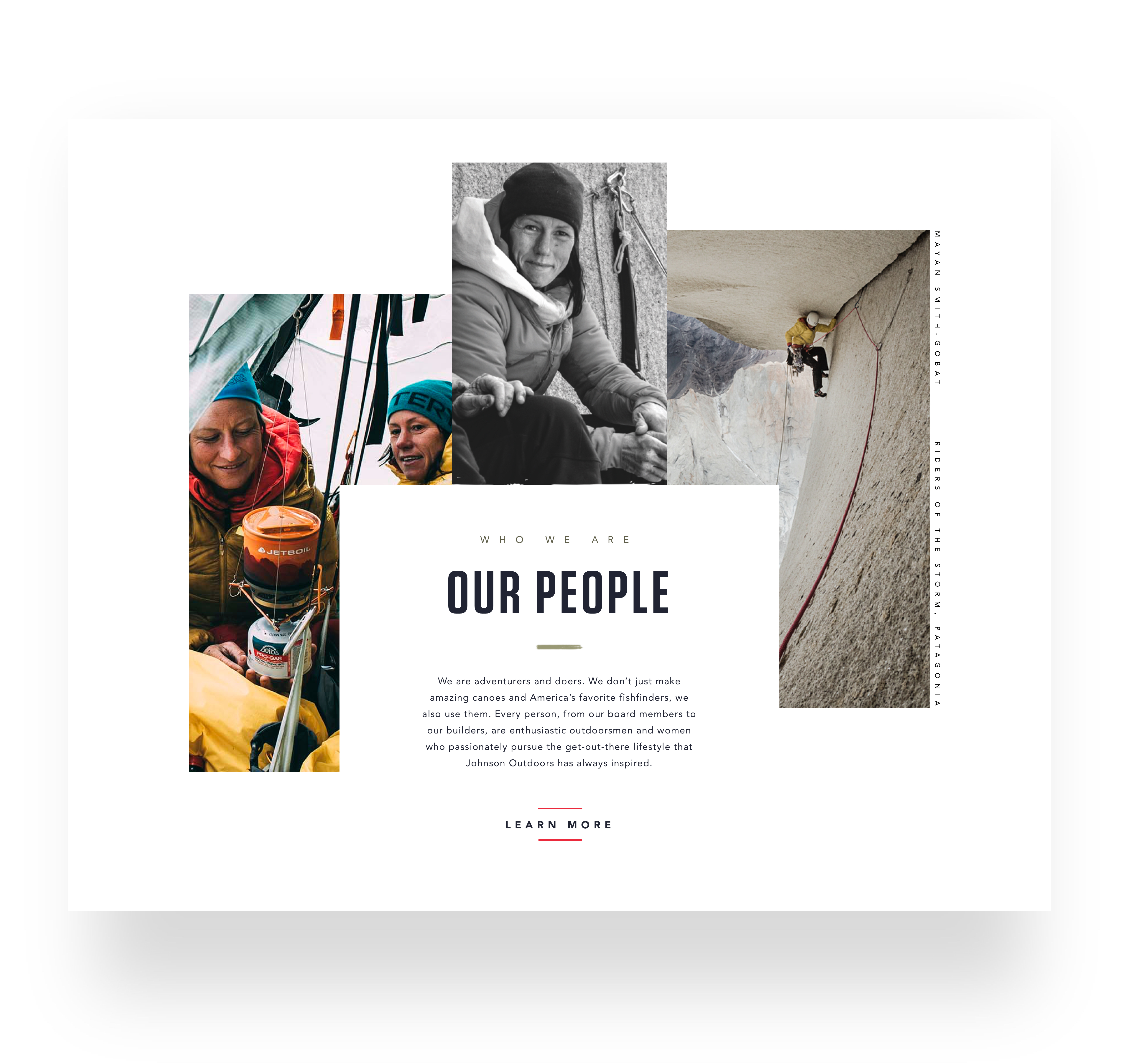
We designed and launched 8 ecommerce sites on 1 component library in just over a year.
I lead the visual and systems design for the project; working with a team of 2 - 5 designers at a given period. We delivered 1,619 screens to development. Averaging a 30 day average for each experience. Broken out by 3 - 2 week sprints. 5 days for documentation. 5 days for design QA. A true exercise of architecting a component library that flexes across each brand's guidelines and content needs to look and feel different. Have you ever tried to fit a circle into a square hole 8 different ways? It was from within these confined component attributes and technical contrstraints that bred creativity. An all out gauntlet of outdoor rec layouts.
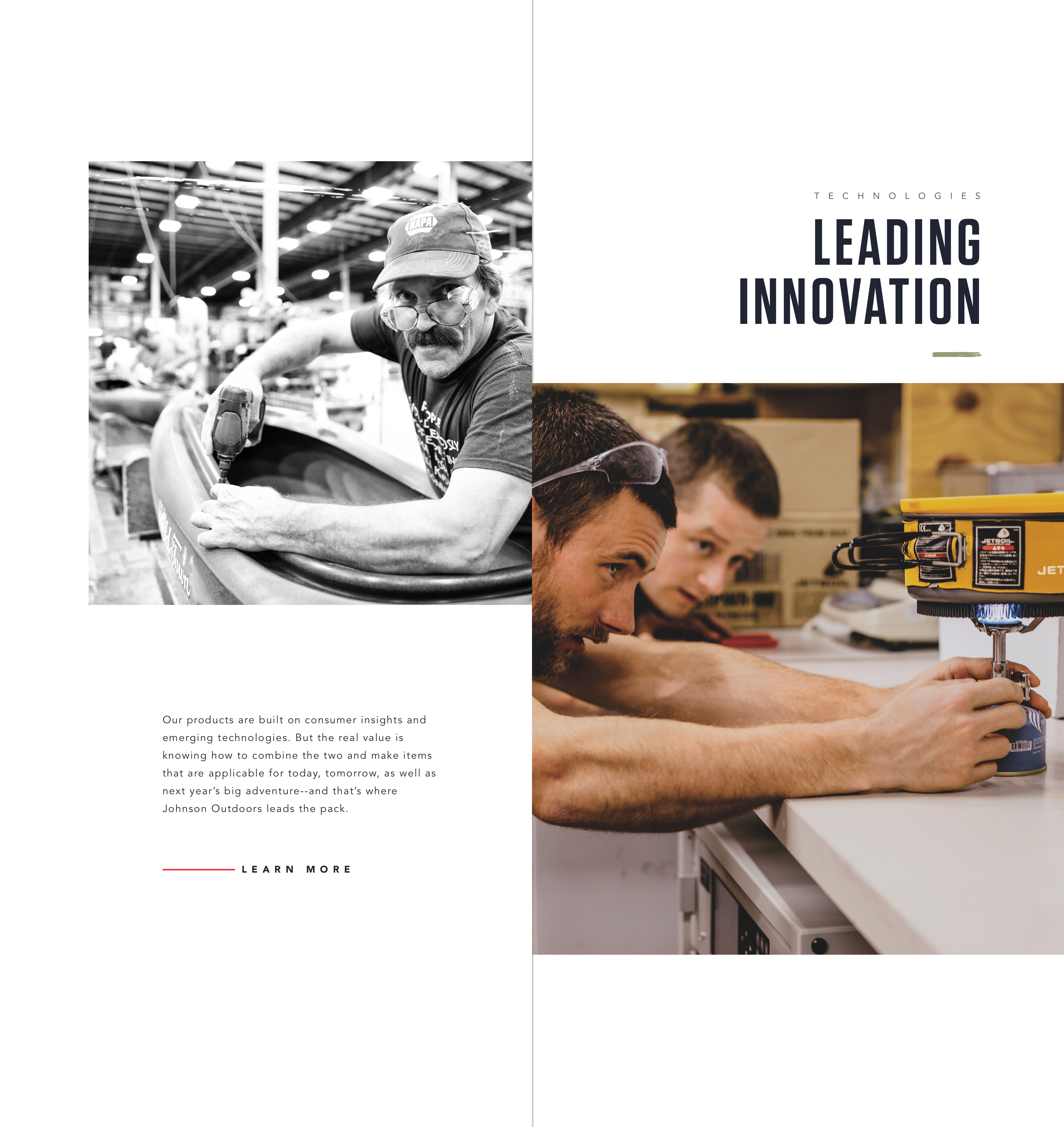
Johnson Outdoors approached us to rebrand their family of brands within a digital space to become more relevant complete with a cross-platform shopping experience. They're owned by the same family as SC Johnson. You've probably heard of Jetboil if you're a backcountry adventurer, ScubaPro if you're a seasoned diver, or Old Town if you like rippin' floaties, with friends, sippin' freshies. Our goal is to make them as relevant (or more) than their distinguished portfolio of outdoor recreation brands.






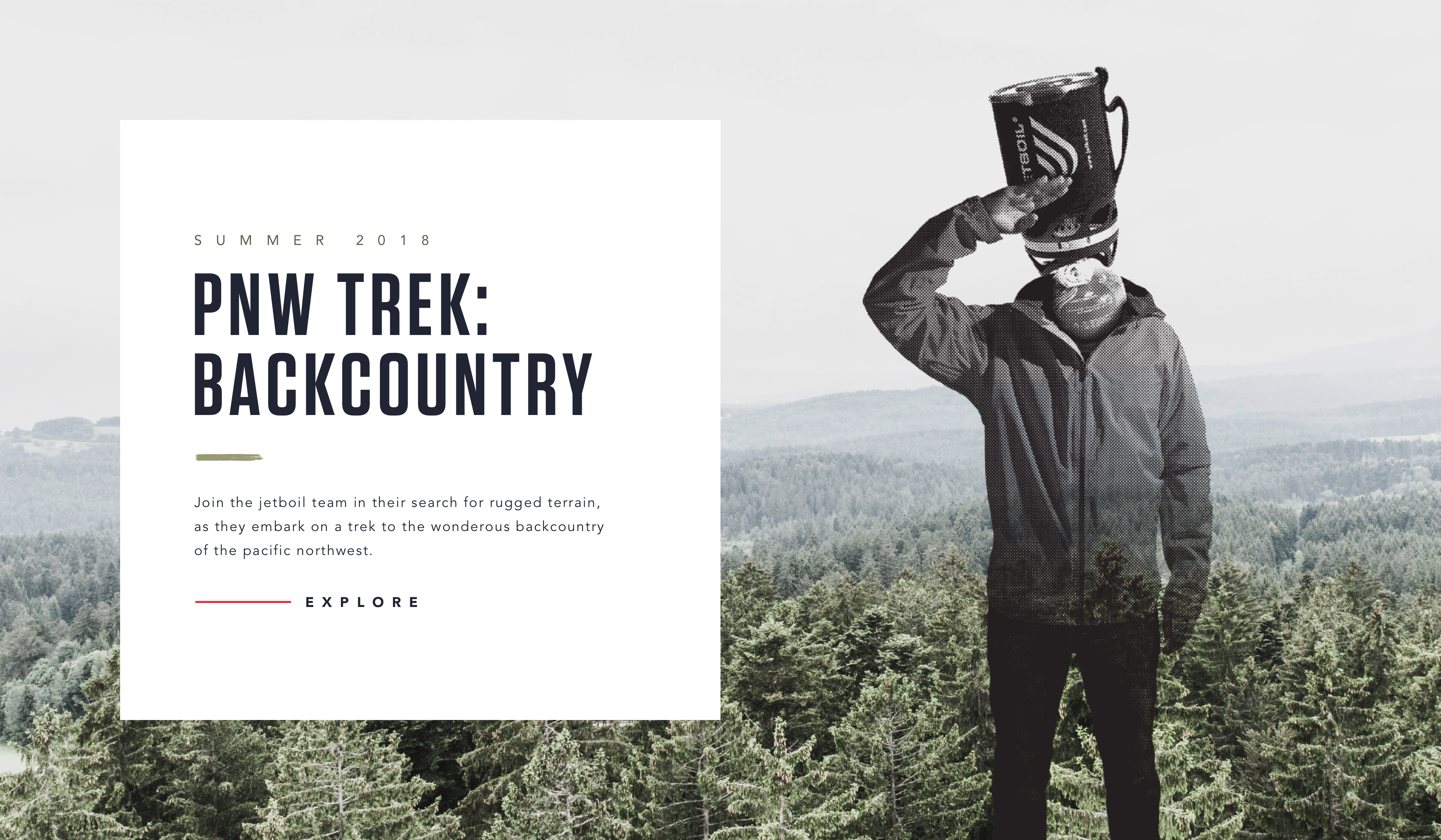

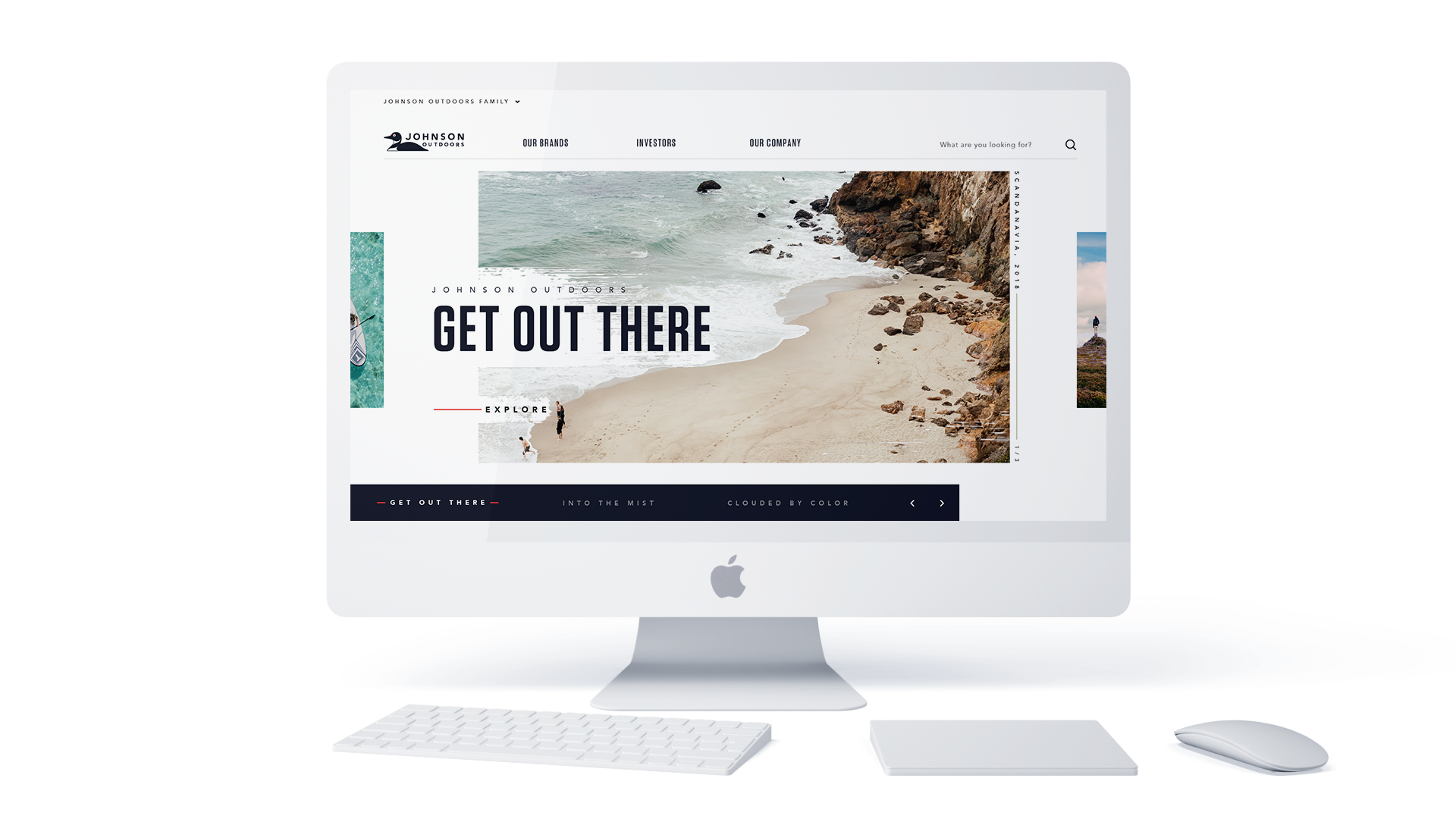

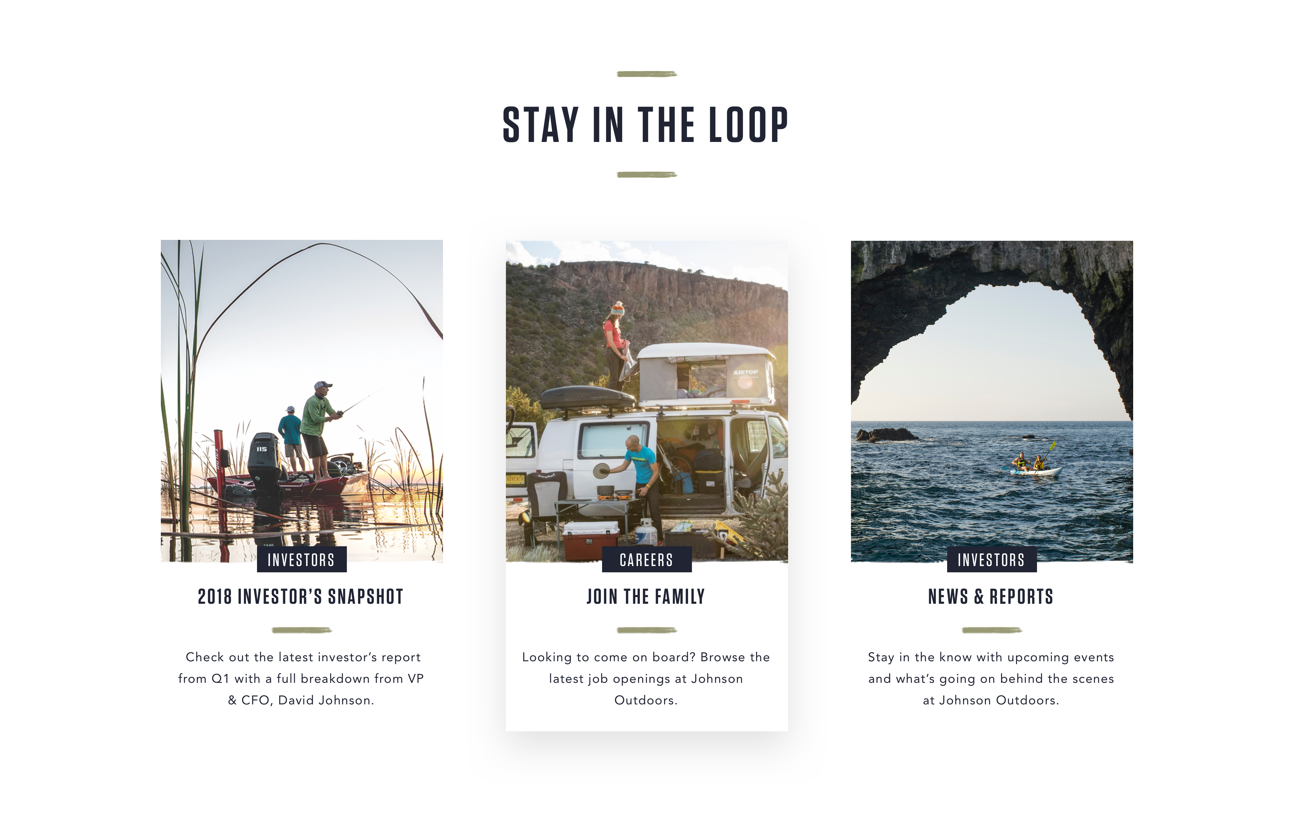

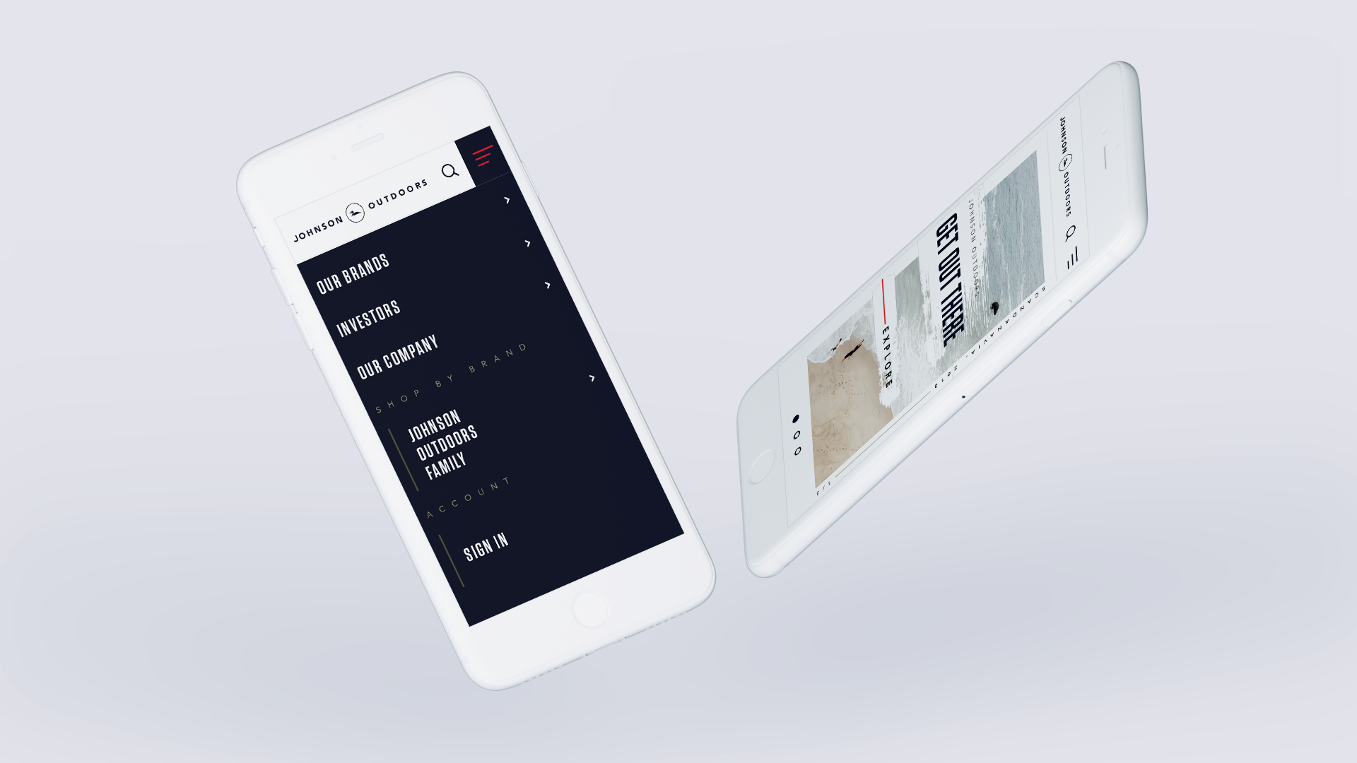


S T Y L E S F O R M I L E S
The Process
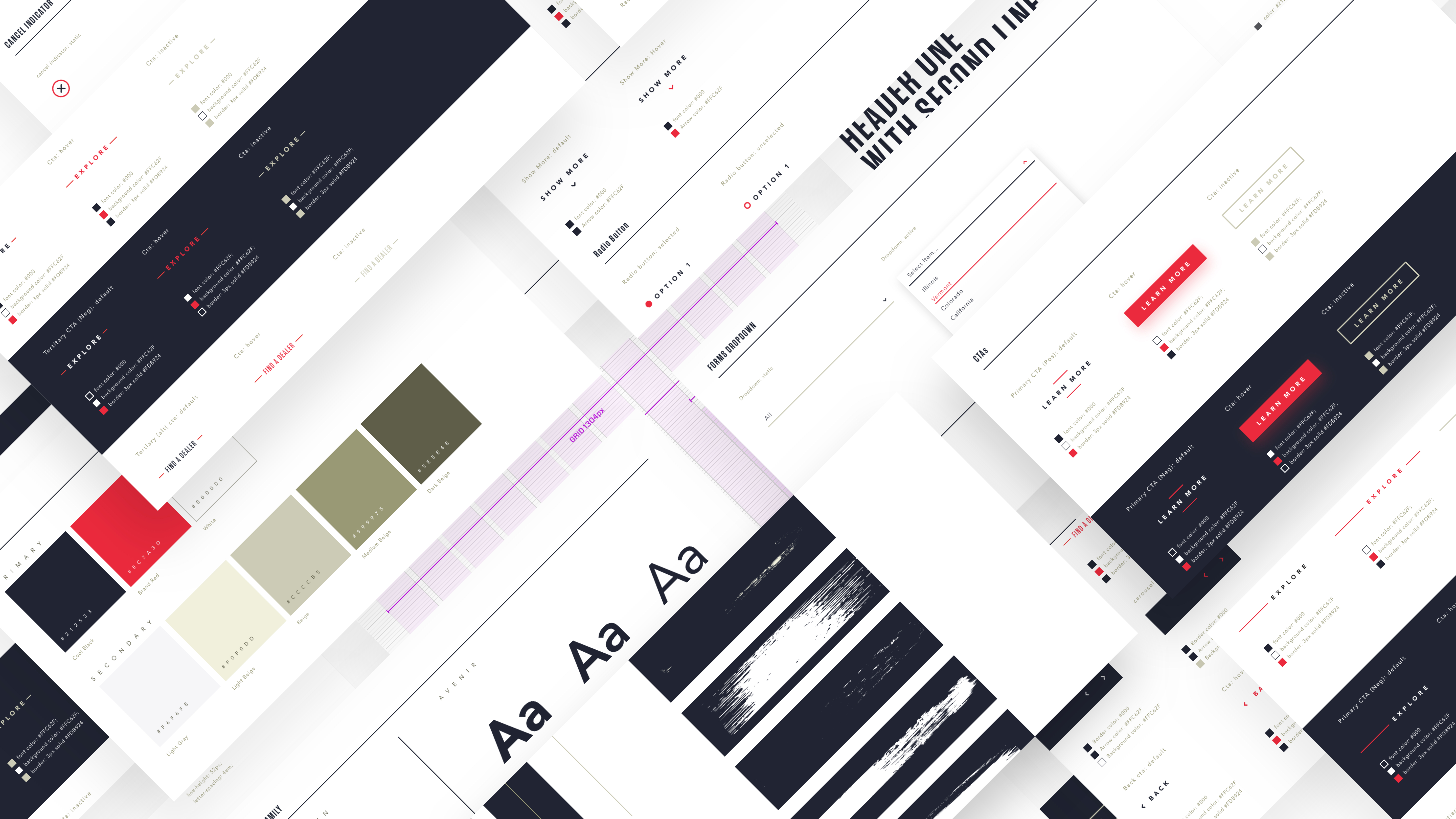
I begin by inheriting brand guidelines and creating a digital version for my team to work from. In the case of the JO corp site I created the brand guidelines from scratch. You can take a deeper look at the work here. From there we use Sketch with shared a library for symbols (you have to love symbols, especially those in the cloud). This cuts down on misaligned CTAs and an egregious amount of type styles.
Once typestyles and UI elements have been established it's time to hit the ground running. There were 2 creative reviews to get the concept pages approved, so the pressure was on. We broke out the sprints into three 2-week cylces with weekly check-ins with the client that I ran. The number of designers on each site varied depending on availability. We found a sweet spot with 3 designers and one lead. This allowed us to divvy up the work to adjust for the poorly planned project timeline. There was only a day of time baked into the sprints for hand-off to development so once we cranked through the 'stamped' pages this allowed designers to get ahead of work on file prep and motion design for marketing components.
The set of tools used depended on your preference, as long you can get the job done. Sketch was the most used tool. We did (most of) our motion design work in Principle, due to tight timelines and the ease of migration from Sketch (but let's be honest, Ae FTW). Lightroom was the best way to manage all of the image selects from the brand teams. Illustrator for vector and icon work. Photoshop for anything that Sketch couldn't do (I miss the brush tool dearly).
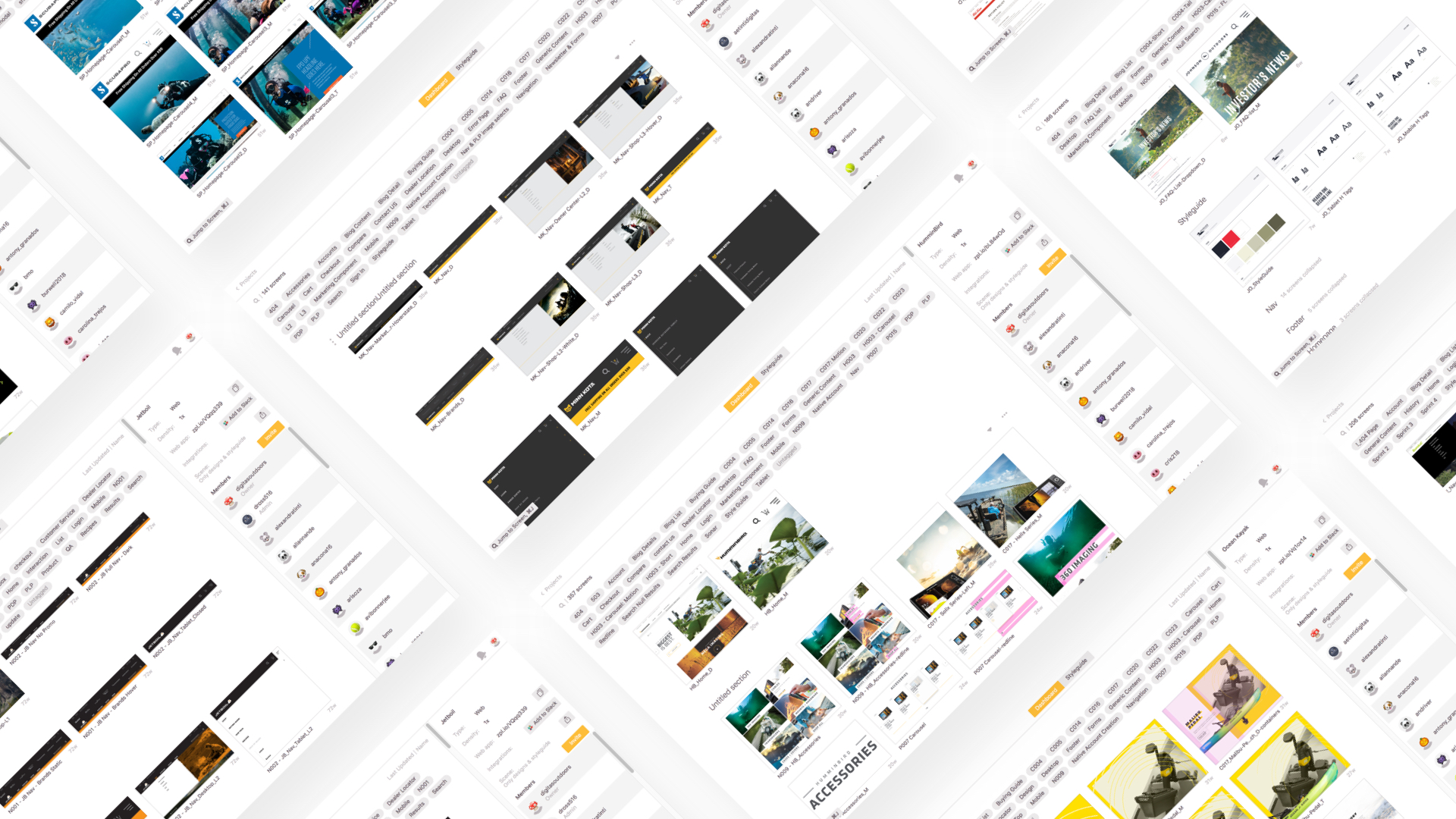
Lastly, we uploaded all of artboards onto Zeplin for hand off to tech. Complete with a highly organized folder structure and documentation on what's what, so those colored circles with the numbers in them actually mean something. & since Sketch has horrific typestyles, our design team would 'redbox' typographic distances so tech knew exactly what spacing was required.
* Phew * 8 sites in 1 year O__o
* Disclaimer: I would not recommend this timeline to anyone, but we miraculously got the job done.

Visit the Johnson Outdoors family
